ggplot2 Tutorial
export MODULEPATH="${MODULEPATH}:/hpc/modules/workshop"
module --ignore-cache load r_rstudio
srun -p development,htc,mic -c 1 --mem=6G --pty -t 0-2 m2_rstudio
library(tibble)
library(ggplot2)
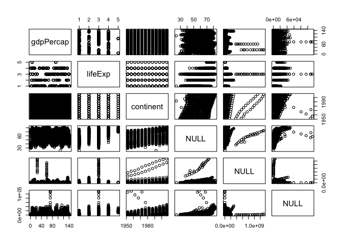
Load the gapminder data package.
library(gapminder)
gapminder
## # A tibble: 1,704 × 6
##        country continent  year lifeExp      pop gdpPercap
##         <fctr>    <fctr> <int>   <dbl>    <int>     <dbl>
## 1  Afghanistan      Asia  1952  28.801  8425333  779.4453
## 2  Afghanistan      Asia  1957  30.332  9240934  820.8530
## 3  Afghanistan      Asia  1962  31.997 10267083  853.1007
## 4  Afghanistan      Asia  1967  34.020 11537966  836.1971
## 5  Afghanistan      Asia  1972  36.088 13079460  739.9811
## 6  Afghanistan      Asia  1977  38.438 14880372  786.1134
## 7  Afghanistan      Asia  1982  39.854 12881816  978.0114
## 8  Afghanistan      Asia  1987  40.822 13867957  852.3959
## 9  Afghanistan      Asia  1992  41.674 16317921  649.3414
## 10 Afghanistan      Asia  1997  41.763 22227415  635.3414
## # ... with 1,694 more rows
ggplot(gapminder, aes(x = gdpPercap, y = lifeExp)) # nothing to plot yet!
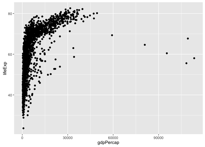
ggplot(gapminder, aes(x = gdpPercap, y = lifeExp)) +
  geom_point()
p <- ggplot(gapminder, aes(x = gdpPercap, y = lifeExp)) # just initializes
scatterplot
p + geom_point()

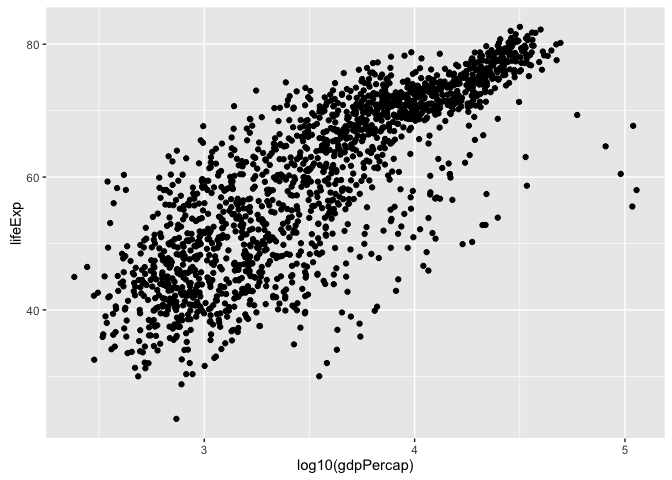
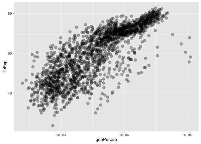
log transformation … quick and dirty
ggplot(gapminder, aes(x = log10(gdpPercap), y = lifeExp)) +
  geom_point()
a better way to log transform
p + geom_point() + scale_x_log10()

let’s make that stick
p <- p + scale_x_log10()
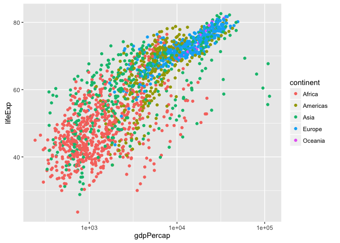
common workflow: gradually build up the plot you want re-define the object ‘p’ as you develop “keeper” commands convey continent by color: MAP continent variable to aesthetic color
p + geom_point(aes(color = continent))
## add summary(p)!
plot(gapminder, aes(x = gdpPercap, y = lifeExp, color = continent)) +
  geom_point() + scale_x_log10() # in full detail, up to now
## Error in plot(gapminder, aes(x = gdpPercap, y = lifeExp, color = continent)) + : non-numeric argument to binary operator
address overplotting: SET alpha transparency and size to a value
p + geom_point(alpha = (1/3), size = 3)
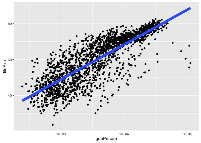
add a fitted curve or line
p + geom_point() + geom_smooth()
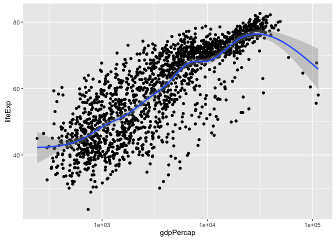
p + geom_point() + geom_smooth(lwd = 3, se = FALSE)

p + geom_point() + geom_smooth(lwd = 3, se = FALSE, method = "lm")
revive our interest in continents!
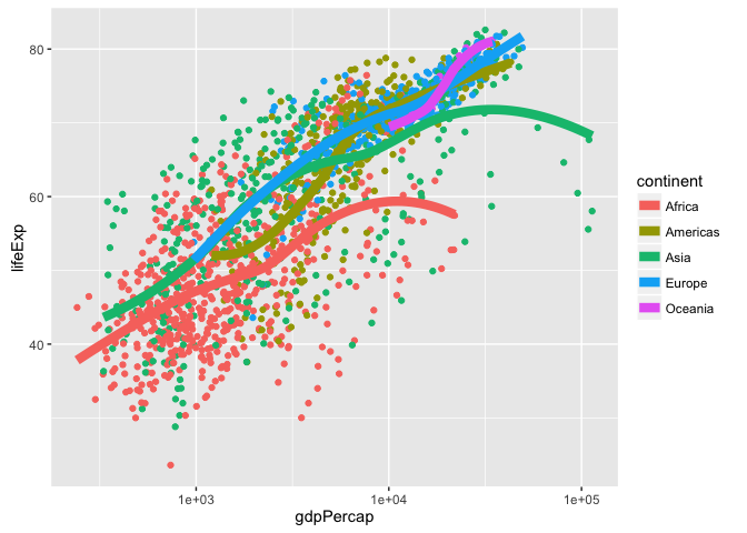
p + aes(color = continent) + geom_point() +
  geom_smooth(lwd = 3, se = FALSE)
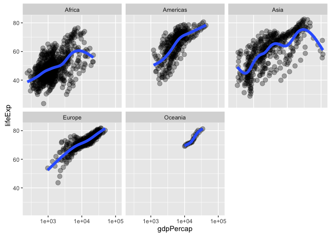
facetting: another way to exploit a factor
p + geom_point(alpha = (1/3), size = 3) +
  facet_wrap(~ continent)
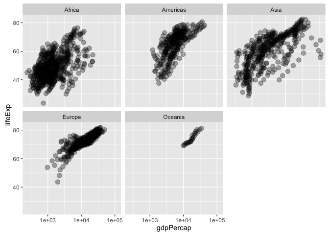
p + geom_point(alpha = (1/3), size = 3) +
  facet_wrap(~ continent) +
  geom_smooth(lwd = 2, se = FALSE)
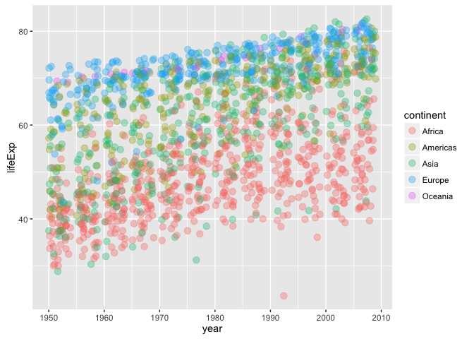
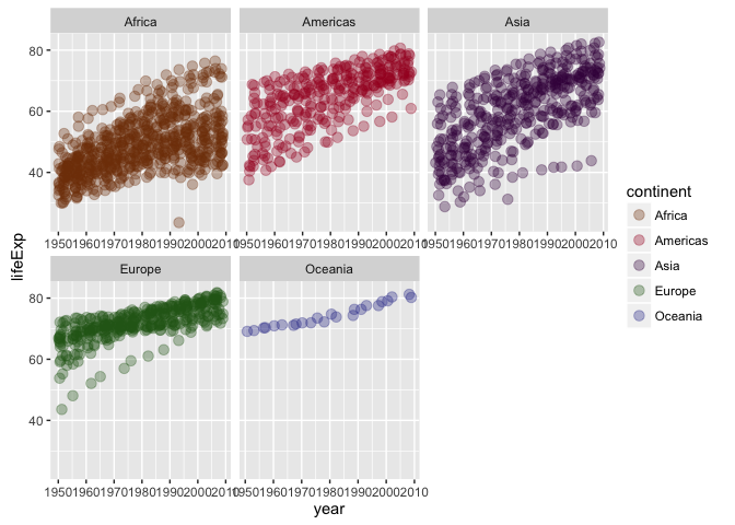
exercises: * plot lifeExp against year
ggplot(gapminder, aes(x = year, y = lifeExp,
                      color = continent)) +
  geom_jitter(alpha = 1/3, size = 3)
make mini-plots, split out by continent HINT: use facet_wrap()
ggplot(gapminder, aes(x = year, y = lifeExp,
                      color = continent)) +
  facet_wrap(~ continent, scales = "free_x") +
  geom_jitter(alpha = 1/3, size = 3) +
  scale_color_manual(values = continent_colors)
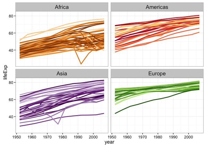
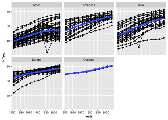
ggplot(subset(gapminder, continent != "Oceania"),
       aes(x = year, y = lifeExp, group = country, color = country)) +
  geom_line(lwd = 1, show_guide = FALSE) + facet_wrap(~ continent) +
  scale_color_manual(values = country_colors) +
  #scale_color_brewer()+
  theme_bw() + theme(strip.text = element_text(size = rel(1.1)))
## Warning: `show_guide` has been deprecated. Please use `show.legend`
## instead.
add a fitted smooth and/or linear regression, w/ or w/o facetting
ggplot(gapminder, aes(x = year, y = lifeExp,
                      color = continent)) +
  facet_wrap(~ continent, scales = "free_x") +
  geom_jitter(alpha = 1/3, size = 3) +
  scale_color_manual(values = continent_colors) +
  geom_smooth(lwd = 2)

use
dplyr::filter()to plot lifeExp against year for just one country or continent
jc <- "Cambodia"
gapminder %>%
  filter(country == jc) %>%
  ggplot(aes(x = year, y = lifeExp)) +
  labs(title = jc) +
  geom_line()
## Error in eval(expr, envir, enclos): could not find function "%>%"
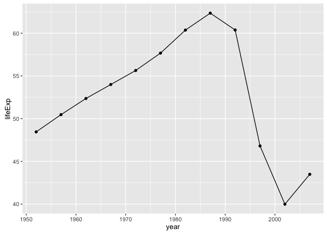
rwanda <- gapminder %>%
  filter(country == "Rwanda")
## Error in eval(expr, envir, enclos): could not find function "%>%"
p <- ggplot(rwanda, aes(x = year, y = lifeExp)) +
  labs(title = "Rwanda") +
  geom_line()
## Error in ggplot(rwanda, aes(x = year, y = lifeExp)): object 'rwanda' not found
print(p)

ggsave("rwanda.pdf")
## Saving 7 x 5 in image
ggsave("rwanda.pdf",plot = p)
## Saving 7 x 5 in image
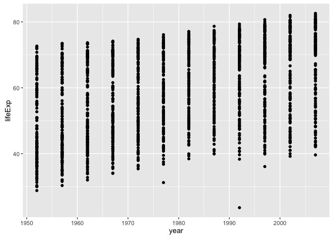
other ideas? plot lifeExp against year
(y <- ggplot(gapminder, aes(x = year, y = lifeExp)) + geom_point())
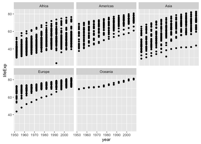
make mini-plots, split out by continent
y + facet_wrap(~ continent)
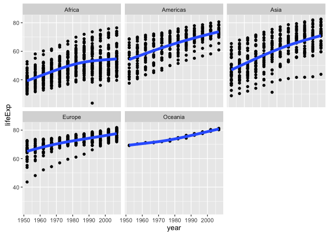
add a fitted smooth and/or linear regression, w/ or w/o facetting
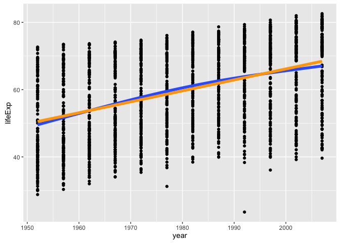
y + geom_smooth(se = FALSE, lwd = 2) +
  geom_smooth(se = FALSE, method ="lm", color = "orange", lwd = 2)
y + geom_smooth(se = FALSE, lwd = 2) +
  facet_wrap(~ continent)
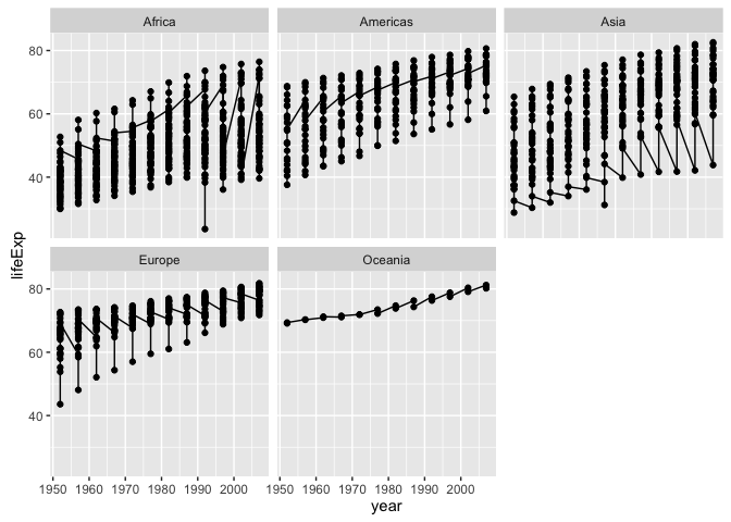
last bit on scatterplots how can we “connect the dots” for one country? i.e. make a spaghetti plot?
y + facet_wrap(~ continent) + geom_line() # uh, no
y + facet_wrap(~ continent) + geom_line(aes(group = country)) # yes!
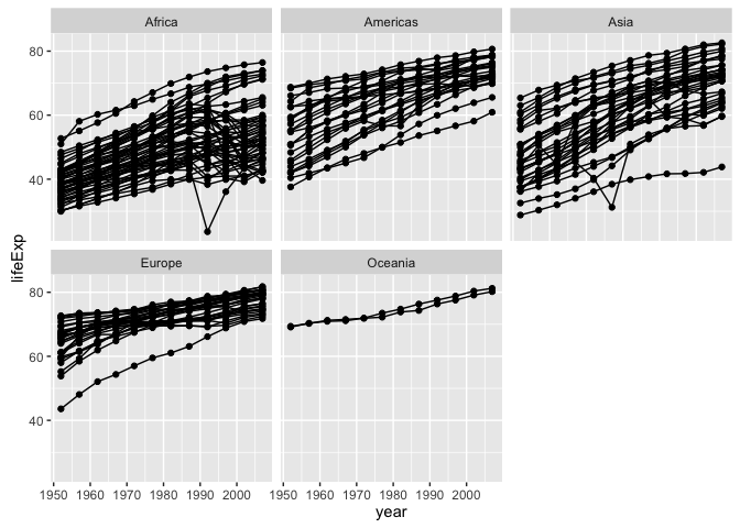
y + facet_wrap(~ continent) + geom_line(aes(group = country)) +
  geom_smooth(se = FALSE, lwd = 2)
note about subsetting data sadly, ggplot() does not have a ‘subset =’ argument so do that ‘on the fly’ with subset(…, subset = …)
ggplot(subset(gapminder, country == "Zimbabwe"),
       aes(x = year, y = lifeExp)) + geom_line() + geom_point()

or could do with dplyr::filter
suppressPackageStartupMessages(library(dplyr))
ggplot(gapminder %>% filter(country == "Zimbabwe"),
       aes(x = year, y = lifeExp)) + geom_line() + geom_point()
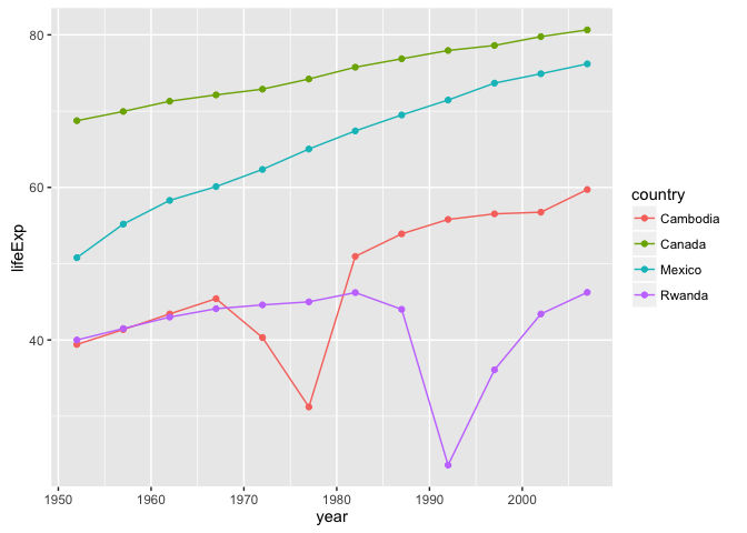
let just look at four countries
jCountries <- c("Canada", "Rwanda", "Cambodia", "Mexico")
ggplot(subset(gapminder, country %in% jCountries),
       aes(x = year, y = lifeExp, color = country)) + geom_line() + geom_point()
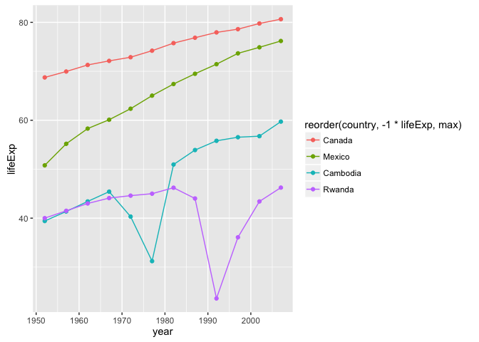
when you really care, make your legend easy to navigate this means visual order = data order = factor level order
ggplot(subset(gapminder, country %in% jCountries),
       aes(x = year, y = lifeExp, color = reorder(country, -1 * lifeExp, max))) +
  geom_line() + geom_point()
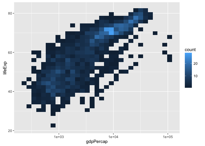
another approach to overplotting ggplot(gapminder, aes(x = gdpPercap, y = lifeExp)) +
ggplot(gapminder, aes(x = gdpPercap, y = lifeExp)) +
  scale_x_log10() + geom_bin2d()
sessionInfo()
## R version 3.3.1 (2016-06-21)
## Platform: x86_64-apple-darwin13.4.0 (64-bit)
## Running under: OS X 10.11.6 (El Capitan)
##
## locale:
## [1] en_CA.UTF-8/en_CA.UTF-8/en_CA.UTF-8/C/en_CA.UTF-8/en_CA.UTF-8
##
## attached base packages:
## [1] stats     graphics  grDevices utils     datasets  methods   base
##
## other attached packages:
## [1] dplyr_0.5.0     gapminder_0.2.0 ggplot2_2.1.0   tibble_1.2
## [5] knitr_1.14.2
##
## loaded via a namespace (and not attached):
##  [1] Rcpp_0.12.7        magrittr_1.5       munsell_0.4.3
##  [4] colorspace_1.2-6   lattice_0.20-33    R6_2.1.3
##  [7] stringr_1.1.0      plyr_1.8.4         tools_3.3.1
## [10] grid_3.3.1         gtable_0.2.0       nlme_3.1-128
## [13] mgcv_1.8-13        DBI_0.4-1          htmltools_0.3.5
## [16] lazyeval_0.2.0     yaml_2.1.13        assertthat_0.1
## [19] digest_0.6.10      Matrix_1.2-6       formatR_1.4
## [22] evaluate_0.9       rmarkdown_1.0.9014 labeling_0.3
## [25] stringi_1.1.1      scales_0.4.0