matplotlib
Let’s Start with:
export MODULEPATH="${MODULEPATH}:/hpc/modules/workshop"
module --ignore-cache load python_jupyter
cp -R /hpc/examples/workshops/hpc/python-inflammation ~/
cd ~/python-inflammation
srun -p development,htc,mic -c 1 --mem=6G --pty -t 0-2 m2_jupyter_lab
Select the Python 3 install in the Jupyter Lab window.
Visualizing data
The mathematician Richard Hamming once said, “The purpose of computing is insight, not numbers,” and
the best way to develop insight is often to visualize data. Visualization deserves an entire
lecture of its own, but we can explore a few features of Python’s matplotlib library here. While
there is no official plotting library, matplotlib is the de facto standard. First, we will
import the pyplot module from matplotlib and use two of its functions to create and display a
heat map of our data:
import numpy
import matplotlib.pyplot
data = numpy.loadtxt(fname='inflammation-01.csv', delimiter=',')
image = matplotlib.pyplot.imshow(data)
matplotlib.pyplot.show()
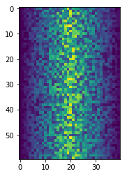
Blue pixels in this heat map represent low values, while yellow pixels represent high values. As we can see, inflammation rises and falls over a 40-day period.
Some IPython Magic
If you’re using a Jupyter notebook, you’ll need to execute the following command in order for your matplotlib images to appear in the notebook when
show()is called:%matplotlib inlineThe
%indicates an IPython magic function - a function that is only valid within the notebook environment. Note that you only have to execute this function once per notebook.
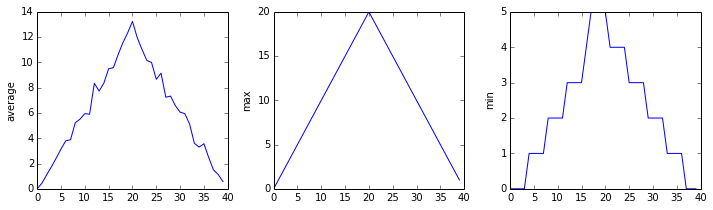
Let’s take a look at the average inflammation over time:
ave_inflammation = numpy.mean(data, axis=0)
ave_plot = matplotlib.pyplot.plot(ave_inflammation)
matplotlib.pyplot.show()
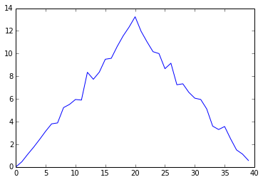
Here, we have put the average per day across all patients in the variable ave_inflammation, then
asked matplotlib.pyplot to create and display a line graph of those values. The result is a
roughly linear rise and fall, which is suspicious: we might instead expect a sharper rise and slower
fall. Let’s have a look at two other statistics:
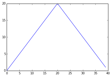
max_plot = matplotlib.pyplot.plot(numpy.max(data, axis=0))
matplotlib.pyplot.show()
min_plot = matplotlib.pyplot.plot(numpy.min(data, axis=0))
matplotlib.pyplot.show()
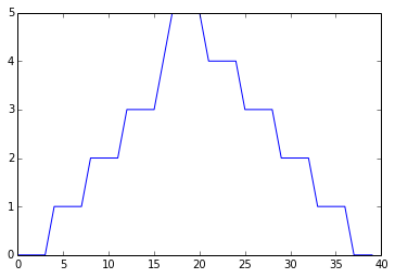
The maximum value rises and falls smoothly, while the minimum seems to be a step function. Neither trend seems particularly likely, so either there’s a mistake in our calculations or something is wrong with our data. This insight would have been difficult to reach by examining the numbers themselves without visualization tools.
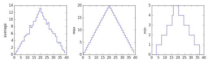
Grouping plots
You can group similar plots in a single figure using subplots.
This script below uses a number of new commands. The function matplotlib.pyplot.figure()
creates a space into which we will place all of our plots. The parameter figsize
tells Python how big to make this space. Each subplot is placed into the figure using
its add_subplot method. The add_subplot method takes 3
parameters. The first denotes how many total rows of subplots there are, the second parameter
refers to the total number of subplot columns, and the final parameter denotes which subplot
your variable is referencing (left-to-right, top-to-bottom). Each subplot is stored in a
different variable (axes1, axes2, axes3). Once a subplot is created, the axes can
be titled using the set_xlabel() command (or set_ylabel()).
Here are our three plots side by side:
import numpy
import matplotlib.pyplot

data = numpy.loadtxt(fname='inflammation-01.csv', delimiter=',')

fig = matplotlib.pyplot.figure(figsize=(10.0, 3.0))

axes1 = fig.add_subplot(1, 3, 1)
axes2 = fig.add_subplot(1, 3, 2)
axes3 = fig.add_subplot(1, 3, 3)

axes1.set_ylabel('average')
axes1.plot(numpy.mean(data, axis=0))

axes2.set_ylabel('max')
axes2.plot(numpy.max(data, axis=0))

axes3.set_ylabel('min')
axes3.plot(numpy.min(data, axis=0))

fig.tight_layout()

matplotlib.pyplot.show()
The call to loadtxt reads our data,
and the rest of the program tells the plotting library
how large we want the figure to be,
that we’re creating three subplots,
what to draw for each one,
and that we want a tight layout.
(If we leave out that call to fig.tight_layout(),
the graphs will actually be squeezed together more closely.)
Check Your Understanding
What values do the variables
massandagehave after each statement in the following program? Test your answers by executing the commands.mass = 47.5 age = 122 mass = mass * 2.0 age = age - 20 print(mass, age)Solution
95.0 102
Sorting Out References
What does the following program print out?
first, second = 'Grace', 'Hopper'
third, fourth = second, first
print(third, fourth)
Solution
Hopper Grace
Slicing Strings
A section of an array is called a slice. We can take slices of character strings as well:
element = 'oxygen'
print('first three characters:', element[0:3])
print('last three characters:', element[3:6])
first three characters: oxy last three characters: genWhat is the value of
element[:4]? What aboutelement[4:]? Orelement[:]?Solution
oxyg
en
oxygen
What is
element[-1]? What iselement[-2]?Solution
n
e
Given those answers, explain what
element[1:-1]does.Solution
Creates a substring from index 1 up to (not including) the final index, effectively removing the first and last letters from ‘oxygen’
Thin Slices
The expression
element[3:3]produces an empty string, i.e., a string that contains no characters. Ifdataholds our array of patient data, what doesdata[3:3, 4:4]produce? What aboutdata[3:3, :]?Solution
array([], shape=(0, 0), dtype=float64)
array([], shape=(0, 40), dtype=float64)
Plot Scaling
Why do all of our plots stop just short of the upper end of our graph?
Solution
Because matplotlib normally sets x and y axes limits to the min and max of our data (depending on data range)
If we want to change this, we can use the
set_ylim(min, max)method of each ‘axes’, for example:axes3.set_ylim(0,6)Update your plotting code to automatically set a more appropriate scale. (Hint: you can make use of the
maxandminmethods to help.)Solution
# One method
axes3.set_ylabel('min')
axes3.plot(numpy.min(data, axis=0))
axes3.set_ylim(0,6)
Solution
# A more automated approach
min_data = numpy.min(data, axis=0)
axes3.set_ylabel('min')
axes3.plot(min_data)
axes3.set_ylim(numpy.min(min_data), numpy.max(min_data) * 1.1)
Drawing Straight Lines
In the center and right subplots above, we expect all lines to look like step functions because non-integer value are not realistic for the minimum and maximum values. However, you can see that the lines are not always vertical or horizontal, and in particular the step function in the subplot on the right looks slanted. Why is this?
Solution
Because matplotlib interpolates (draws a straight line) between the points. One way to do avoid this is to use the Matplotlib
drawstyleoption:import numpy import matplotlib.pyplot data = numpy.loadtxt(fname='inflammation-01.csv', delimiter=',') fig = matplotlib.pyplot.figure(figsize=(10.0, 3.0)) axes1 = fig.add_subplot(1, 3, 1) axes2 = fig.add_subplot(1, 3, 2) axes3 = fig.add_subplot(1, 3, 3) axes1.set_ylabel('average') axes1.plot(numpy.mean(data, axis=0), drawstyle='steps-mid') axes2.set_ylabel('max') axes2.plot(numpy.max(data, axis=0), drawstyle='steps-mid') axes3.set_ylabel('min') axes3.plot(numpy.min(data, axis=0), drawstyle='steps-mid') fig.tight_layout() matplotlib.pyplot.show()
Make Your Own Plot
Create a plot showing the standard deviation (
numpy.std) of the inflammation data for each day across all patients.Solution
std_plot = matplotlib.pyplot.plot(numpy.std(data, axis=0))
matplotlib.pyplot.show()
Moving Plots Around
Modify the program to display the three plots on top of one another instead of side by side.
Solution
import numpy
import matplotlib.pyplot

data = numpy.loadtxt(fname='inflammation-01.csv', delimiter=',')

# change figsize (swap width and height)
fig = matplotlib.pyplot.figure(figsize=(3.0, 10.0))

# change add_subplot (swap first two parameters)
axes1 = fig.add_subplot(3, 1, 1)
axes2 = fig.add_subplot(3, 1, 2)
axes3 = fig.add_subplot(3, 1, 3)

axes1.set_ylabel('average')
axes1.plot(numpy.mean(data, axis=0))

axes2.set_ylabel('max')
axes2.plot(numpy.max(data, axis=0))

axes3.set_ylabel('min')
axes3.plot(numpy.min(data, axis=0))

fig.tight_layout()

matplotlib.pyplot.show()
Stacking Arrays
Arrays can be concatenated and stacked on top of one another, using NumPy’s
vstackandhstackfunctions for vertical and horizontal stacking, respectively.import numpy A = numpy.array([[1,2,3], [4,5,6], [7, 8, 9]]) print('A = ') print(A) B = numpy.hstack([A, A]) print('B = ') print(B) C = numpy.vstack([A, A]) print('C = ') print(C)A = [[1 2 3] [4 5 6] [7 8 9]] B = [[1 2 3 1 2 3] [4 5 6 4 5 6] [7 8 9 7 8 9]] C = [[1 2 3] [4 5 6] [7 8 9] [1 2 3] [4 5 6] [7 8 9]]Write some additional code that slices the first and last columns of
A, and stacks them into a 3x2 array. Make sure toSolution
A ‘gotcha’ with array indexing is that singleton dimensions are dropped by default. That means
A[:, 0]is a one dimensional array, which won’t stack as desired. To preserve singleton dimensions, the index itself can be a slice or array. For example,A[:, :1]returns a two dimensional array with one singleton dimension (i.e. a column vector).D = numpy.hstack((A[:, :1], A[:, -1:])) print('D = ') print(D)D = [[1 3] [4 6] [7 9]]Solution
An alternative way to achieve the same result is to use Numpy’s delete function to remove the second column of A.
D = numpy.delete(A, 1, 1)
print('D = ')
print(D)
D = [[1 3] [4 6] [7 9]]
Change In Inflammation
This patient data is longitudinal in the sense that each row represents a series of observations relating to one individual. This means that the change in inflammation over time is a meaningful concept.
The
numpy.diff()function takes a NumPy array and returns the differences between two successive values along a specified axis. For example, a NumPy array that looks like this:npdiff = numpy.array([ 0, 2, 5, 9, 14])Calling
numpy.diff(npdiff)would do the following calculations and put the answers in another array.[ 2 - 0, 5 - 2, 9 - 5, 14 - 9 ]numpy.diff(npdiff)array([2, 3, 4, 5])Which axis would it make sense to use this function along?
Solution
Since the row axis (0) is patients, it does not make sense to get the difference between two arbitrary patients. The column axis (1) is in days, so the difference is the change in inflammation – a meaningful concept.
numpy.diff(data, axis=1)If the shape of an individual data file is
(60, 40)(60 rows and 40 columns), what would the shape of the array be after you run thediff()function and why?Solution
The shape will be
(60, 39)because there is one fewer difference between columns than there are columns in the data.How would you find the largest change in inflammation for each patient? Does it matter if the change in inflammation is an increase or a decrease?
Solution
By using the
numpy.max()function after you apply thenumpy.diff()function, you will get the largest difference between days.numpy.max(numpy.diff(data, axis=1), axis=1)array([ 7., 12., 11., 10., 11., 13., 10., 8., 10., 10., 7., 7., 13., 7., 10., 10., 8., 10., 9., 10., 13., 7., 12., 9., 12., 11., 10., 10., 7., 10., 11., 10., 8., 11., 12., 10., 9., 10., 13., 10., 7., 7., 10., 13., 12., 8., 8., 10., 10., 9., 8., 13., 10., 7., 10., 8., 12., 10., 7., 12.])If inflammation values decrease along an axis, then the difference from one element to the next will be negative. If you are interested in the magnitude of the change and not the direction, the
numpy.absolute()function will provide that.Notice the difference if you get the largest absolute difference between readings.
numpy.max(numpy.absolute(numpy.diff(data, axis=1)), axis=1)array([ 12., 14., 11., 13., 11., 13., 10., 12., 10., 10., 10., 12., 13., 10., 11., 10., 12., 13., 9., 10., 13., 9., 12., 9., 12., 11., 10., 13., 9., 13., 11., 11., 8., 11., 12., 13., 9., 10., 13., 11., 11., 13., 11., 13., 13., 10., 9., 10., 10., 9., 9., 13., 10., 9., 10., 11., 13., 10., 10., 12.])
Based on the tutorials by the The Carpentries.